

Last updated on 9th August 2023
In June 1833, a strange word appeared in the French newspaper, Le Figaro. Invented by Belgian physicist Joseph Plateau, the “phenakistiscope” was (and still is!) a device that, when rotated by a human user, transformed static images into moving pictures…

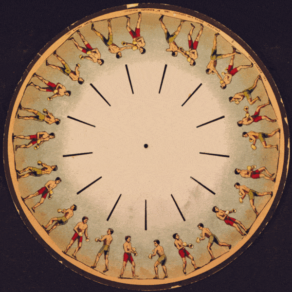
This caused nothing short of a sensation among the 19th-century public, to whom the illusion of motion must have seemed like pure magic.
People flocked to get a look at the technology, and phenakistiscopes were soon being produced and sold commercially in significant numbers.
Not only did the phenakistiscope capture public imagination in its own right – it precipitated a wave of public fascination with motion that would, slowly but surely, lead to what we now call animation and motion graphics.
Of course, the movement itself was the main appeal. But the fact that the human user was in control of that motion must have also played its part.
As a species, humans love to play and interact – the idea that our input manipulates the world around us is an innate part of our baked-in curiosity.
And it’s funny because exactly the same principle applies to a new and fascinating phenomenon in the web design world: the rise of the microinteraction.
What is a microinteraction?
Essentially – a bit like the phenakistoscope – a microinteraction is a moment of animated interaction between a user and a website. They can be so subtle you hardly even notice them, but these little animations turn bland, mundane actions into delightful, memorable moments.
Think of the animated ‘thumbs-up’ when you like a post on Facebook. Or the ‘shake’ animation when you enter your password incorrectly.
Just like the phenakistoscope: we manipulate something ‘static,’ and marvel as it comes to life through movement.
In this article, we’re going to lay out 15 amazing examples to inspire you. Check ‘em out!
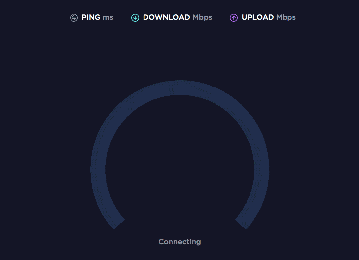
1. Speedometer (Speedtest)
Speedtest is a simple but powerful tool that – while it may not win any awards for creative naming – certainly delivers the service you’d expect!
Testing your internet speed can take anything from a few seconds up to a few minutes, so it’s important that the user knows something is happening once they start the test.
This microinteraction features a ‘speedometer’ which demonstrates how the speed test is going, as well as a sort of progress bar along the top of the screen that visualises how long is left. Eventually, the result is displayed once the test is complete.
Micro animations like this one give users a glimpse of the technicality that’s going on behind the scenes, and it makes the experience more impactful, memorable and engaging. The alternative – which might be a ‘Please wait’ screen followed by a number on screen after a minute or so – would clearly be nowhere near as impressive. People might actually wrongly assume nothing is happening and leave before the test is complete.
2. Lock screen (RememBear)
If you’re the sort of person who has to send password reminders every time you log into every site you use, you could probably use a tool like RememBear!
This is an app that stores your passwords and automatically fills them in for you. It’s a simple enough app but the real differentiator is the awesome branding – as you’d expect from the ‘Bear’ component in the name, they’re heavily branded around a cute bear mascot.
You have to remember one single password to log into RememBear and access all your other login details. Logging in is usually a pretty humdrum experience – but RememBear makes it super-fun by having the bear mascot watch you enter it. He turns red if you get it wrong – and green when you log in correctly. This makes the whole process so much more impactful.
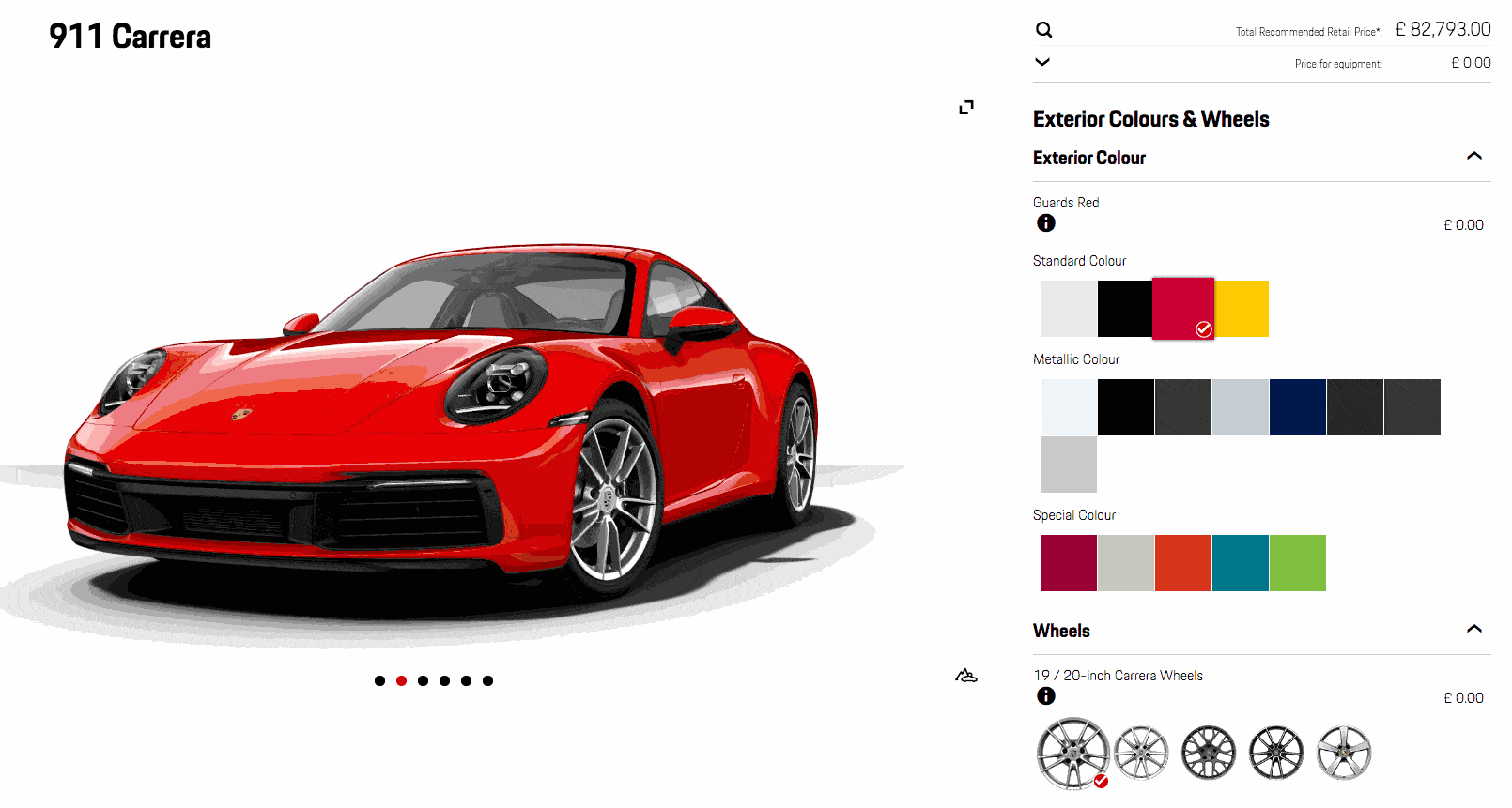
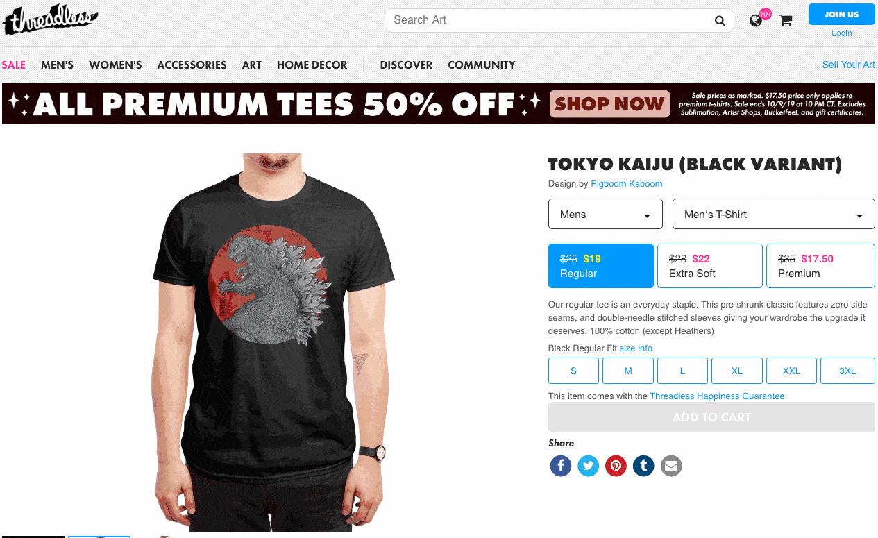
3. Car Configurator (Porsche)
Let’s be honest; a Porsche is no ordinary car. And designing one shouldn’t be an ordinary experience!
The Porsche Car Configurator is an online tool that lets you build your perfect Porsche – including style, colour, wheel types and more. As you make tweaks and changes to your vehicle, the car actually changes to reflect your choices, and the price updates in real-time.
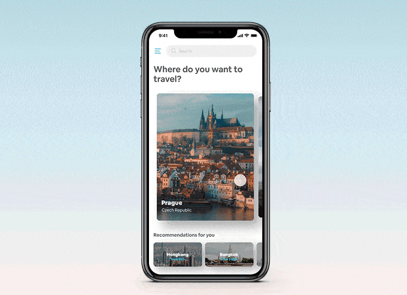
4. Swipe (HongSeon Kim)
This next example is a concept created by Korean illustrator HongSeon Kim and shared over on Dribbble. The ‘swipe’ concept uses parallax to make ‘swiping’ a much more interesting, dynamic experience.
It’s demonstrated within the context of a travel app, where the user can ‘drag’ the destination across the screen, and then click to expand the one they’re interested in. But this concept would work well across any app where swiping is required.
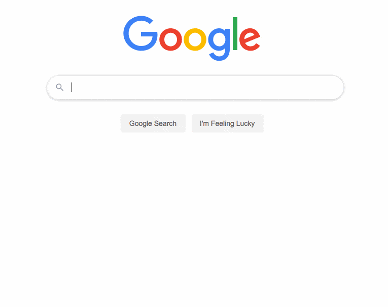
5. Autocomplete (Google)
In many ways, Google has looked and felt very similar for years.
Changes to their branding and website design have been gradual, slow and steady. It’s often hard to notice these changes as they happen, because they’re so subtle.
But one significant change has been the addition of suggested searches. As the user enters their search query, Google anticipates – based on regular search terms – what the user is likely to be looking for, and offers a range of suggestions. The user can simply click or scroll down to the one they want.
Not only does this save the time of entering full search terms – it also gives an oversight of what other people are searching for around a particular topic. This can drive users to perform more searches, finding more content – and, ultimately, get more value out of Google services.
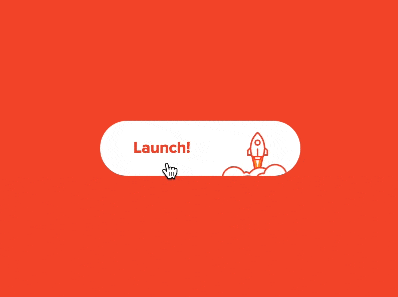
6. Submit button (Cameron Sagey/Vincit California)
The ‘Submit’ button is the logical endpoint of any online form. We found this offering from designer Cameron Sagey over on Dribbble, and it demonstrates how even the most mundane experience – clicking ‘submit’ – can be made into a memorable moment.
This example uses the word ‘Launch’ instead of ‘Submit’ – and accompanies this with a fun line-drawn rocket icon that blasts out of the button when the user clicks it. Finally, the button closes with a ‘tick’ icon on a black background to represent that the form has actually been sent. This means the user isn’t left wondering whether it actually worked. In all respects this is a beautiful example!
7. Facebook reactions (Seth Eckert – Dribbble)
‘Likes’ have always been a central part of the Facebook experience. But in February 2016, the social media channel introduced a new series of ‘reactions’ that allowed people to express different emotions to the content they saw – ‘like’ was still there but was joined by love, laughter, shock, sadness, and anger.
The animations here are so subtle that you might not even have noticed them, but every time you react to a post on Facebook, you’ll see an animation for each reaction type…
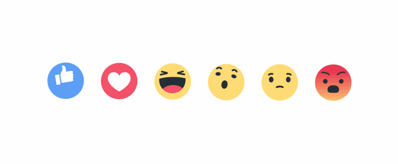
This is followed by a smaller animation based on the reaction you choose, as it appears on the post.
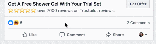
This is really powerful because the function is all about expressing emotion. The animation of each icon really emphasises that feeling – allowing the user to express their reaction in a way that’s slightly more visceral and meaningful.
8. Pull to refresh (Srikant Shetty/Hike)
In the age of real-time news and content, we certainly find ourselves using the ‘refresh’ function more than ever! Whether it’s news pages, social media feeds or our favourite forums, we want the latest and greatest content, which often means refreshing the page.
Of course, ‘refreshing’ used to mean that the whole page would close and reload from scratch. These days there’s much more room for creative solutions like the example below. This is another concept from Dribbble, created by Srikant Shetty at Hike.
When the user drags down to refresh the page, they get a cool, fun animation based on a Hike sticker.
In the designer’s own words, “This helps to add a moment of delight and also improve discovery of these stickers in Hike.”
9. Email swipe actions (Emmanuelle Bories)
Email and mobile are two of the dominant trends in online tech today. But they don’t always play together particularly well. Organising a mobile inbox can still actually be surprisingly painful.
This microinteraction, shared by Emmanuelle Bories on Dribbble, offers a different and much nicer way to organise a mobile inbox – using the user ‘swipe’ to allow them to specify how an email should be treated. A short swipe and release allows them to mark an email as read, while they can ‘snooze’ an email with a longer swipe.
10. Social share (Tom Bird)
Social shares are an incredibly important device for amplifying content reach. So, of course, making it easier and more enjoyable to share content can only be a good thing!
This example from Tom Bird on Dribbble is an interesting way to use micro animations to enhance the sharing experience.
Here, when the user hits the ‘Share’ the icons for Facebook, Twitter and LinkedIn ‘fan out’ into a sort of wheel. The user clicks one of the channels and the content is quickly and easily shared. It’s quick, seamless and fun.
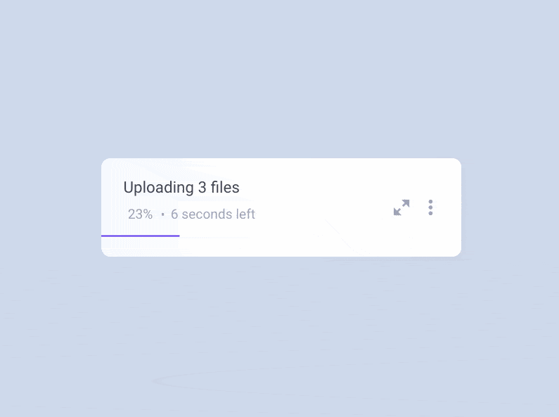
11. Uploading (Aaron Iker)
Uploading and downloading – depending on file size – aren’t immediate processes. It’s important, then, to give the user an idea of where things are up to and how long is remaining. There’s nothing particularly new about that – but microinteractions certainly allow you to deliver this experience in a much more elegant and artful way.
Check out this concept, created by Aaron Iker on Dribbble. When uploading, we can see a progress line animating from left to right. When the user hits pause, this line greys out and drops to the bottom of the window, and the lines that make up the ‘pause’ icon rotate and transform into a ‘resume’ icon. Resuming the upload brings the line back up, restores its colour and continues its progress from left to right. When the upload is complete, the line morphs once again into a tick.
12. Add to cart (Threadless)
Threadless is an eCommerce website that sells t-shirts and apparel, featuring designs by its community of artists. They sell a wide range of different designs – but also have their own clearly-defined brand, which is fun, modern and young.

This strong brand combines with micro animations to create a really nice experience when you buy a product. When the user clicks ‘Add to Cart,’ a popup appears, featuring a cute ‘Cart’ character who licks his lips and announces “1 yummy item added to my carty belly!”
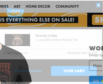
In a competitive space like the t-shirt and apparel market, this is a great way to stand out and make a lasting impression on the customer.
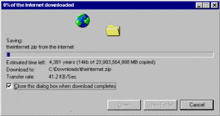
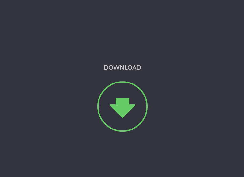
13. Download button (Gal Shir)
We’ve already touched on the fact that downloads really need progress indicators to make sure the user knows how long it’s likely to take. Historically this has looked a little like this…
But here’s a really fresh, unique take – it’s another concept from Dribbble, created by Gal Shir.
When the user hits the ‘Download’ button, the arrow inverts, and then parachutes back down to earth, hitting terra firma as the download reaches 100%.
14. Fail screen (Netguru/Hive)
It’s never ideal when something doesn’t work. But, when it does happen, it’s important for brands to appear in control and limit the damage. Microinteractions can be a great way to turn a negative into a positive – as exemplified by productivity platform, Hive.
Whenever something goes wrong on Hive, users see an animation accompanied by the message “Oops…something went wrong” and the instruction to ‘Pull up to refresh.’
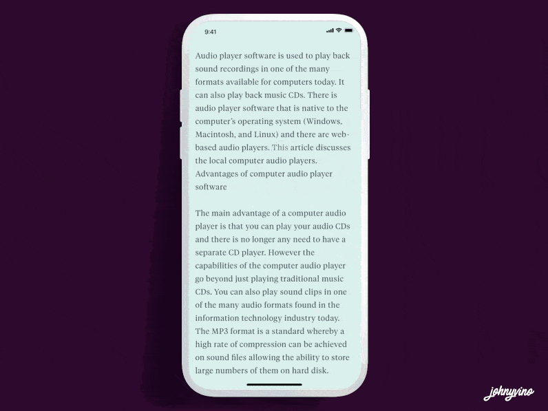
15. Highlight and share (Johny Vino)
We’ve already touched on the value of social sharing – but what if you don’t want to share the whole article, just a snippet? There are ways to do this but it’s generally pretty uninspiring. The classic ‘share’ model might draft a social post that includes the plain text, plus a @via tag and the URL.
But so much of success on social media boils down to visuals nowadays. This concept, created and shared by Johny Vino on Dribbble, is a far more visual solution. Just highlight the text you want to share, then select ‘Share’ from the sleek, animated menu. This will then generate an image to go alongside your share, with a toolbar along the bottom of the screen to let you select just the right image.
Thanks for reading
As you can see from these examples, microinteractions are a great way to use motion to create deep, impactful, memorable experiences for users across their online journey – uploads, downloads, add to carts, fail screens and everything in between!
Are you interested in getting your own Microinteractions? Check out our Microinteractions page for more information about our service – and inspiration!


